Feature Redesign of BC's COVID App (Thrive Health)

UI, User Research & Content Strategy // Academic Work
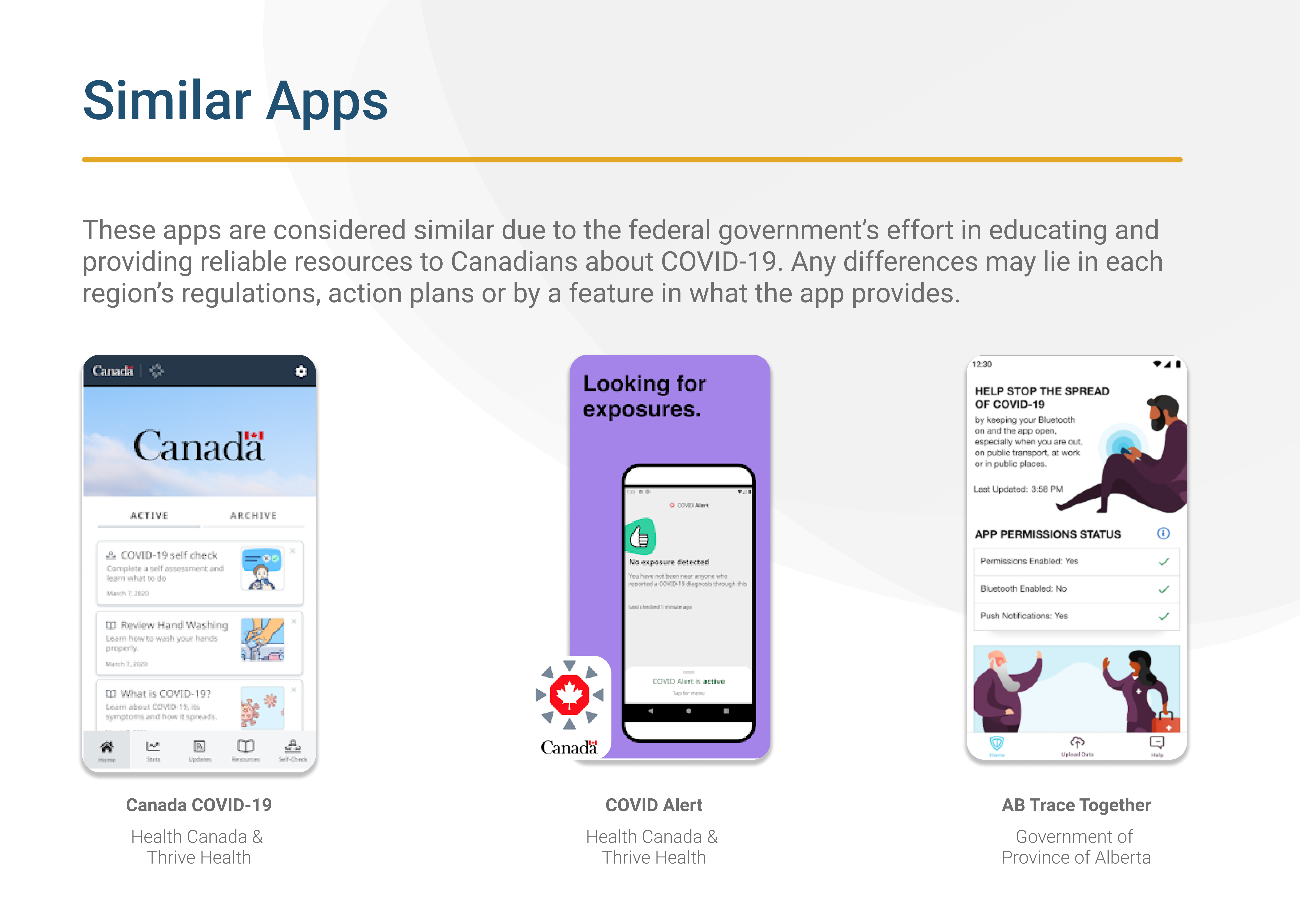
For Thrive Health's BC COVID-19 App, I've proposed a new feature (the Self-Assessment) and an improved user interaction to give value towards a user’s individual health management. This was a heuristic evaluation for a class assignment where I used Nielsen Norman’s Group of 10 Usability Heuristics as criteria to test for usability issues and provide a new or improve design proposal.

👉Click to try out the proposal’s prototype here
Course: IAT 334 - Interface Design
Role: User Interface Design, User Research, Interaction Design & Content Strategy
Tools: Figma, Illustrator, Photoshop, Miro
Time: 1.5 weeks (July-August 2020)
Deliverables: Persona Chart, User Journey Map, Prototype
PRODUCT BACKGROUND

BC COVID-19 Support App

Developed in partnership with the BC Ministry of Health, our assessment tool has been recommended by WorkSafeBC and has already been been adopted by businesses large and small across the province.
— Thrive Health, 2020

Heuristic Evaluation

Accessing Translated Content Adds Too Many Steps For User
The first usability heuristic that could be improved is the Flexibility/Efficiency of Use. English-as-a-second-language (EAL) users will try to find a way to understand the content and may search for translated content. They’re lead through a series of clicks and need to navigate through disorganized information cards.
Accessing & Completing The Self-Assessment (SA) Is A Rigid Process
The app is primarily used to read content and updates. The only interaction feature designed for the user is through the SA, where users see if they need additional COVID-19 testing by a professional healthcare provider. If they do not, the user is led to more content on the app to monitor themselves. There are three heuristics that have been broken within this feature.
  • Aesthetic & Minimal Design (AMD)
  • Visibility of System Status (VSS)
  • Flexibility and Usage (FAU)
With repetition and layout of content, the AMD and VSS heuristics have been broken. Users are delayed in starting the SA’s test because of the lack of visual hierarchy and text-heavy screen, but also struggle to complete it because of confusing feedback responses from their selection. The FAU heuristic is also affected as users are still required to search for and click through a series of buttons to access the SA feature.

Stakeholder Research

Designing With Government’s Priorities In Mind
The government focuses on the needs of the public, but as designers we need to identify who our users are that we can create a solution to solver their problem. Therefore, I did some research of what pain points, needs and concerns the government has as a stakeholder to evaluate where to balance the needs of both stakeholders involved. (The other stakeholder being the user.)

The following are key points that the solution must follow to retain trust from the general public in the government's service offered:
  • Protect Privacy
  • Transparency
  • Consistency
Maintaining Trust From General Public Is The Priority
Recognizing the need to display inclusivity within a government policy or product correlates to the amount of trust residents of that government has. This trust is important for the government’s credibility in service and function. An example of this accessibility effort is through their focus of translating their verified content in the different minority languages and providing PDF links or linking multiple resources under predicted scenarios such as looking for a COVID-19 testing centre.
User Research Method
I've conducted user research with a Google Survey to learn if the participants had downloaded the app or not. I wanted to find out the frequency of the usage, if they've uninstalled it from their devices and if their were other methods they were using to stay informed or what they prioritized in finding COVID-19 info.
User Research Summary
The survey was done by nine individuals who were between the ages of 18 to 30. Over 50% responded that they considered uninstalling it from their phone as they don’t use it often and that the information is still accessible across other resources. 22% said they feel obligated to keep it on their phone as a precaution and having it helped them feel more secure in accessing health care since it the province has published this tool in response to control the pandemic's infection rates.
Competitive Analysis
I followed media briefings from national news, the local health authorities’ media briefing and health care system’s efficiency for other similar existing solutions and their effectiveness. I also looked at existing user reviews of this app for any other user pain points that I may have missed in my user research.

All of the similar solutions focus on being a reliable source of information related to the country and specific to it's own provincial and municipal areas. For the BC app, most feedback was due to cognitive overload of info and feeling lost on what to do or where to go with the info given.

Define Design Opportunity

Persona
A potential user to design for is an EAL young adult who is still trying to get used to BC’s Health system after staying in Canada for at least a year. Sharon is a newcomer to Canada with chronic health issues. With COVID-19 restrictions, it makes it hard for her to access regular check-ups. For full close up of this persona  click here
FINAL SOLUTION

Self-Assessment Redesign

The Self-Assessment Redesign helps users clearly monitor their symptoms through a historical record of the days they've used the tool and with the option to save their results as a PDF to supplement their appointments with their health care provider.
To differentiate the BC COVID-19 app from other similar solutions that are used as another source of verified information, I’ve proposed that the SA feature expands to a section where users can assess themselves (existing) and where users can access their assessment records (new).

This adds additional value to the app as users can conveniently export their results to supplement to their online (or in-person) appointments with medical professionals, rather than limit them to consuming the content inside the app.

While not a diagnostic tool, it improves user’s sense of control over their own health as they monitor their conditions to determine the steps they need to take if they decide to get additional treatment.
Improving The Existing Self-Assessment Flow
Assessment History (New Sub-Feature)
Save Results to PDF (New Sub-Feature)
Prototype Limitations & Disclaimer
This final prototype was only made to test the improved Self-Assessment Feature and new sub features. Within the navigation bar, only Home and Self-Assessment are responsive.

Disclaimer: This prototype does not reflect accuracy in COVID-19 self-management or provide medical recommendations.

Key Takeaways + What I'd Do Differently

I learned to ask the right questions to build a prototype that would provide an effective solution. Working on an existing app helped me to think critically to identify factors that create the experience through interaction design when I use other apps as well.

If there was another chance to improve this project, I would evaluate the app and COVID-19 scenario at a future date, review any other changes that should be accounted for and iterate my solutions to meet those needs.

References:
Illustrations — unDraw.co
Photos — unSplash.com

So, what’s your story?

Let’s see if our conversation can lead to a new chapter, I prefer to listen. 😉
You can find my contact below!